
The best Sikh app is the one that fits the job
Search for “best Sikh apps” and very different products appear beside one another. Some centre Gurbani and Nitnem. Some stream Kirtan or today’s Hukamnama. Others teach Punjabi, collect historical reference material, or share audio and video. Comparing them as though they are interchangeable produces a list, but not much help.
Begin with one question: what do you want to do when you open the app? If you want to follow a complete scriptural reading, choose a tool designed for that practice. If you want translations and pronunciation support, examine the depth and provenance of those features. If you want one Sikh story to become part of your day, look closely at how the app handles discovery, context, reading, audio, and reflection.
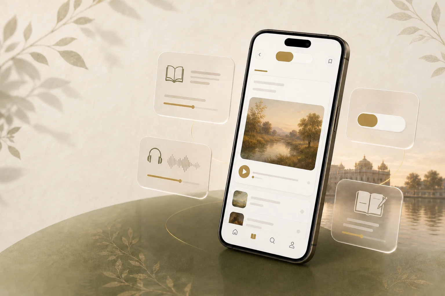
Sehaj is deliberately focused on that final experience. Sehaj: Daily Sikh Stories gives the Saakhi journey a coherent home, from choosing a story to reading, listening, and reflecting.
A modern Sikh app should make the first step obvious
Opening an app with sincere intent and meeting a crowded dashboard can turn learning into another search task. A calm experience gives the eye one clear place to begin. The hierarchy should answer three questions quickly: Where am I? What can I do here? What is the next meaningful action?
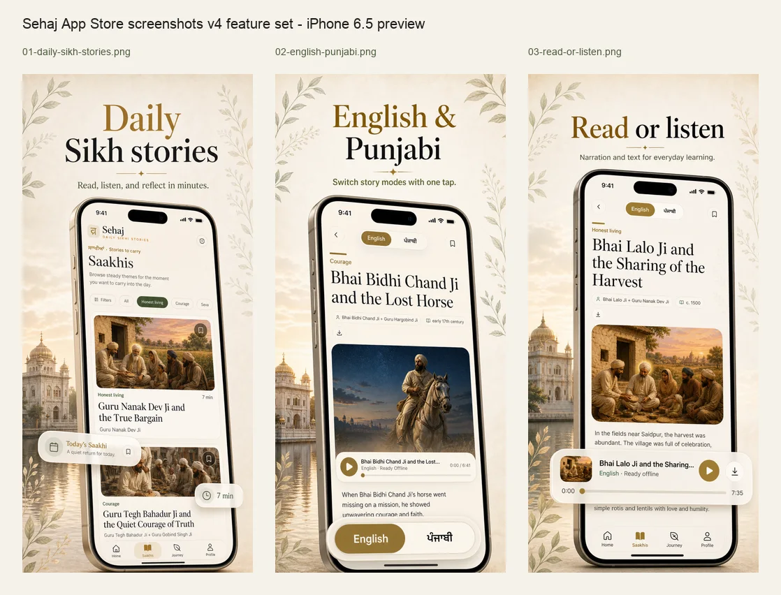
On Sehaj, Home brings forward one daily Saakhi or the story you were already reading. The Saakhis area lets you browse when you want choice, while the main daily invitation remains focused. Story cards show the theme, figure, artwork, and approximate reading time before you commit.
This is more than an aesthetic preference. Apple’s current design principles emphasise purpose, simplicity, hierarchy, and keeping important actions close. W3C cognitive-accessibility guidance likewise recommends clear structure, familiar controls, whitespace, and fewer competing choices. Those principles matter when someone is tired, learning in a second language, or returning after a long gap.
- One primary action is easier to trust than five equal calls to action.
- Estimated time helps a person choose honestly for the moment they have.
- Filters should support exploration without becoming the first obstacle.
- A missed day should lead back to the content, not to a punishment screen.
The experience should feel like one connected flow
Good product design is often felt as continuity. A story discovered in the library should open into the same visual language, preserve your place, expose the right controls at the right time, and close with a clear next step. You should not have to relearn the interface between browsing, reading, listening, and reflecting.
Sehaj uses a small, consistent navigation model: Home for today, Saakhis for the library, Journey for continuity, and Profile for personal settings. Inside a story, the hierarchy stays content-first. The language control, save action, story context, download state, and narration controls remain connected to the Saakhi they affect.
The result is not a sequence of isolated feature demos. It is one journey: choose a story, enter without clutter, move between modes, keep what stayed with you, and know where to return.
Reading design should let the Saakhi lead
A beautiful reading screen is not one with the most decoration. It is one where the typography, spacing, artwork, and controls help the story remain central. Long lines, low contrast, competing cards, or persistent chrome can make even good writing feel demanding.
Sehaj uses a warm paper-like palette, generous spacing, serif display type, calm body text, and story artwork with a clear place in the narrative. Controls are visually quieter than the title and story body. The design language is recognisable across the app without placing a brand flourish on every surface.
The practical test is simple: after a minute, are you thinking about the interface or the story? Craft matters, but its highest purpose here is attention.
English and Punjabi should feel like real modes, not an afterthought
Many people move between English, Punjabi, Gurmukhi, and transliteration in different parts of their lives. A language option hidden deep in settings does not support that reality well. The mode should be visible where the content changes, and the app should be honest when a particular translation or narration is not available.
For selected Saakhis, Sehaj places English and Punjabi story modes directly on the story screen. Changing mode keeps you with the same Saakhi rather than sending you back to search. The interface also labels the active narration language and falls back clearly when a track is unavailable.
This is a small interaction with a large emotional effect. It lets a learner compare, lets a family choose what works in the moment, and treats Punjabi as part of the experience rather than a decorative signal.
Listening should work beyond the ideal connection
Audio makes a Saakhi available while walking, commuting, cooking, or resting the eyes. A modern audio experience needs more than a play triangle: the active story should remain clear, progress should be understandable, and download state should not be mysterious.
Sehaj lets available narration be downloaded to the device. A story can be made ready with its words, artwork, and available audio so the experience degrades gracefully when connectivity is weak. The player remains tied to the current Saakhi and shows the language and duration context a listener needs.
Offline readiness is not glamorous, but it is one of the details that turns a polished demonstration into a dependable daily product.
Reflection should deepen the story without scoring the person
Many habit products use streaks, loss aversion, badges, and urgent reminders to pull people back. Those mechanics can be effective, but spiritual learning can feel thinner when the score becomes more visible than the substance.
Each Sehaj Saakhi closes with a reflection prompt and a private place to write. Journey gathers the rhythm of stories read, listening time, and reflections saved, but the language remains gentle. If you miss a day, there is no debt to repay. You return to the next story.
That choice is part of the product’s modernity. Respectful UX is not only smooth animation and rounded cards; it is also the emotional contract the interface makes with the person using it.
- Prompts stay connected to the specific Saakhi.
- Reflections are private and can be revisited.
- Progress provides orientation without turning devotion into competition.
- Reminders are optional and should arrive in the rhythm a person chooses.
Small trust details matter as much as visual polish
A Sikh stories app handles more than content inventory. Names, dates, source traditions, translations, historical uncertainty, and religious vocabulary all need care. The interface should make room for context instead of presenting every narrative as the same kind of claim.
Sehaj story pages can show who appears in a Saakhi, where it sits in history, and additional details about the account. A correction route lets readers flag something that should be reviewed. Missing content or audio is handled as an unavailable state rather than a broken promise.
These details are quiet by design. Together, they communicate that the team is still working on the experience, listening, and taking accuracy seriously.
A practical checklist for choosing a Sikh app in 2026
Before downloading, look beyond screenshots and ask how the product will behave on an ordinary Tuesday. A great first impression matters; a coherent second and tenth visit matter more.
- Purpose: Is the app clear about the practice or learning job it supports?
- Content: Does it distinguish Gurbani, history, traditional narrative, interpretation, and reflection?
- Language: Are language modes usable in the flow, and are gaps labelled honestly?
- Access: Can reading or audio remain useful with a poor connection?
- Design: Are hierarchy, type, contrast, controls, and touch targets comfortable?
- Continuity: Can you resume without searching or being shamed by a broken streak?
- Trust: Are privacy, payment, sources, corrections, and support easy to understand?
- Fit: After using it, do you feel closer to the content, or busier inside another app?
Why Sehaj feels different
Sehaj is built by a small team that treats product craft as part of the invitation. The visual system is warm and contemporary, but the more important distinction is how each screen supports the same promise: one Sikh story, a few quiet minutes, and a steadier return.
You can browse when you are curious, read when you want stillness, listen when your hands are occupied, move between English and Punjabi on selected stories, make a Saakhi ready offline, save a private reflection, and return without streak pressure. The feature set is deliberate rather than sprawling.
If that is the kind of modern Sikh app you have been looking for in 2026, begin with the official Sehaj experience and see whether the rhythm fits your life.
Sources and further reading
These links provide context for the history, terminology, or traditional account discussed above. Sehaj writes for general learning and reflection, not as a substitute for primary-source study or guidance from trusted Sikh educators.
- Apple App Store: Sehaj: Daily Sikh StoriesThe current official listing for Sehaj, including reading, narration, English and Punjabi modes, reflection, downloads, and journey features.
- Google Play: Sehaj: Daily Sikh StoriesThe current official Android listing for Sehaj: Daily Sikh Stories, identified by package app.sehaj.mobile.
- Apple Human Interface Guidelines: Design principlesApple’s current principles for purpose, flexibility, simplicity, hierarchy, craft, and platform-appropriate design.
- Apple Human Interface Guidelines: AccessibilityGuidance on intuitive, perceivable, adaptable interfaces and reducing cognitive complexity.
- W3C WAI: Use clear and understandable contentSupplemental cognitive-accessibility guidance covering clear language, short blocks, whitespace, and understandable visual structure.
- Sehaj: Official app pageFirst-party product identity, supported platforms, current experience, availability, and frequently asked questions.